Kiwi 3.0
![]() Twitter’s explosive growth is often attributed to the early availability of an API. When other social services were only available through their respective interfaces, Twitter allowed developers to put their own unique style into the presentation of tweets. The service has always been available as a web site, but a large number of users have found their Twitter home inside the screens of Tweetie, Twitterrific, Tweetbot, and a profusion of others. These apps gave the service unique personalities, as well as innovated on the platform. Things at Twitter have changed radically since those early days, and developers are now strongly discouraged from build anything that resembles a traditional Twitter client.
Twitter’s explosive growth is often attributed to the early availability of an API. When other social services were only available through their respective interfaces, Twitter allowed developers to put their own unique style into the presentation of tweets. The service has always been available as a web site, but a large number of users have found their Twitter home inside the screens of Tweetie, Twitterrific, Tweetbot, and a profusion of others. These apps gave the service unique personalities, as well as innovated on the platform. Things at Twitter have changed radically since those early days, and developers are now strongly discouraged from build anything that resembles a traditional Twitter client.
Seeing an opportunity, Dalton Caldwell shifted the focus of his App.net project into becoming a realtime feed API with a striking difference from Twitter: a business model.
For many, what has emerged is an experiment that seems to be working: a sustainable service that charges users a membership fee instead of assaulting them with advertising.[1] App.net (or ADN) users have been given steadily-released features on a platform that has delivered on its promises so far. The only problem has been the lack of really great ADN clients. Caldwell is focused on building a platform, so he’s committed to only building simple clients as reference points for other developers. This is done intentionally to leave room for third party developers to bring their own styles to the market, and many have seized this opportunity. There has been a charge of new clients, especially on mobile platforms, but few have really shone as exceptional. The desktop has been especially void of a stand-out app. I’ve been testing a Mac client for a few months months that fills that void. Say hello to Kiwi.
Kiwi Reborn
![]()
Kiwi for ADN is a new app from Isaiah Carew of YourHead Software. Isaiah had previously shipped two major versions of Kiwi as a Twitter client, but stopped development in 2011. The third version of Kiwi is a completely new app, redesigned specifically for ADN, with simplicity and only the most popular use-cases in mind.
The result is wonderful.
What’s Familiar

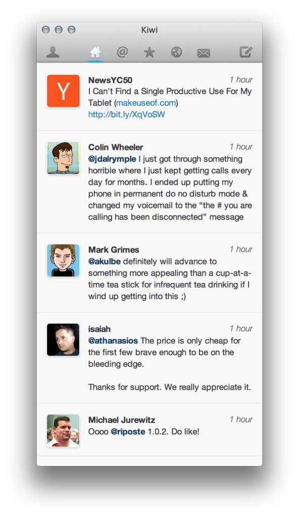
The most striking part of Kiwi is the wonderful simplicity. The app consists of a single window, with transient windows appearing for writing. It’s clear to the user that the main window is for reading, and other windows are for writing. The main view is familiar: a timeline with new posts at the top of the window, and individual items in the stream badged with a user icon and relative timestamp.
The main window dons a simple toolbar without labels. For the most part, the icons are obvious, though folks new to ADN may be surprised to find a Global Stream available. New content in any of the streams is indicated by a subtle blue bar beneath the respective toolbar icon. Artwork is included for both standard and high resolution displays, so Kiwi looks great on new Retina Macbook Pros.
In addition to the traditional icon-clicking and keyboard shortcuts, Kiwi users also have the option of using gestures to switch between streams.
Across the toolbar are icons for User Home, Main Timeline, Mentions, Stars, Global, Channels (Messages), and New Post / Message. When viewing a User Profile (including your own), the toolbar contents are be swapped out for context-aware options: User Home, Mentions, Stars, Following, and Followers.
Composing Posts
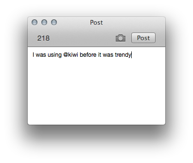
 Unsurprisingly, the Post window in Kiwi is incredibly simple. The same window is used for channel messages as well (with the image button removed). Kiwi currently uses img.ly exclusively for image uploads, though it sounds like ADN’s native file storage will be used in a future release.
The Post window certainly isn’t as flashy, but is obvious and functional. I expect this is an area of the application that will receive enhancement now that Kiwi is publicly available. One key addition will be support for proper ADN linking.
What’s Different
Some of the motivation behind ADN and the clients built for it is fueled by a desire to have similar experiences to those on Twitter. It’s no surprise there are elements common to almost all ADN and Twitter clients alike. Where ADN clients really start to shine is when they include unique features. Many of the available ADN clients sport these features, but making them work well is part of the craft.
Stream Marker
One of the great innovations on Twitter was Manton Reece’s Tweet Marker. Tweet Marker is a service for Twitter clients to mark their read position in a user’s timeline. This lets the user read tweets on one device, and have their position synchronized to other devices. This seems like a logical part of Twitter’s own API, but since it was never provided, Manton built Tweet Marker. It’s a staple feature of all major Twitter clients today.
The folks at ADN saw the value of this functionality and introduced it to the API very early. It’s called Stream Marker on ADN, and Kiwi’s integration is incredibly smooth. Every time the app reloads data from the ADN service, it also reads the marker position. Whenever the app changes views or is replaced as the front-most application, it writes it’s position. The result is a fluid experience that happens in near-realtime.
Muting

ADN also supports user muting, a behavior Twitter apps were forced to implement as client-only features. For users, it meant that users or hashtags muted in Tweetbot or Osfoora would still appear in Twitterrific. Some clients were able to sync mute preferences between instances (like from your iPhone to your iPad), but without an inter-app interface, it wasn’t ideal.
User Muting is a feature of the ADN service, so it can work across all clients. The changes to user muting you make in Kiwi apply to any other ADN client you use with the service, assuming it has properly implemented the behavior.
Mute controls are accessed by viewing a user’s profile (clicking on their username in any post where they’re mentioned, or on their picture). You can also mute users in the Users Following view (people you are following).
Show Replies To Everyone

One of the first Twitter features to receive the ax was broadcasted replies. This behavior is an option in many ADN clients, and I’ve found that many people really enjoy it.
For example, when @jury replies to a user, I see his response, even if it’s to somebody I don’t follow. I might find his response interesting, so I swipe the message to reveal the entire conversation. As it turns out, the people he’s talking to are also people I would enjoy following.
Seeing these replies in your timeline is a great way to meet new people. [3. The explosion of users due to the new free tier may prove to be too much. Some crafty developer will find a unique way to make this manageable for users.]
Vi Keys
Intrepid users will enjoy a subtle, geeky feature. Navigation between stream posts and conversations can be achieved with Vi navigation keys: h, j, k, l. These keys may seem foreign to some users, but the longtime vi user will feel right at home.
Twitter Crossposting
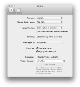
Of course, Kiwi allows you to crosspost to Twitter. Crossposting is enabled in the Preferences window, and applies to new messages; posts created in reply to another post are not sent to Twitter.
Crossposting is a difficult feature to manage, because the desired behavior varies greatly between users. Some wish to crosspost all the time, while others use it infrequently. Exposing the feature somewhere obvious also makes it more likely to be a nuisance to those not interested in it.
There are some Kiwi beta users who have criticized the current interface for crosspost configuration in Kiwi, but I find it easy to understand, simple to locate, and out of the way when I don’t want it. As ADN matures, I’m optimistic that crossposting will be removed from most clients.
What’s Missing
One of the challenges ADN client developers face right now is the rapid motion of the API they’re building against. The service introduces new functionality frequently, and developers have to scramble to meet the demands of their users. It’s unrealistic to expect every single feature to have a place in an application, and I don’t get the impression that it’s the developer’s intention to support all ADN features in Kiwi. There are a few things that would make nice additions to the application.
Places
The promise of a platform that users subscribe to means the possibility of apps being interchanged without the user losing their data. One of my primary uses of Foursquare is keeping track of the places I eat while traveling. After the Gowalla evaporation, it’s not unthinkable that this type of data could be lost if your favorite check-in app closes the doors.
The simple addition of location tagging to ADN opens up the possibility for these types of applications to be built on the network, and having some visibility to into locations where posts are created would be a nice touch in Kiwi.
Article Saving
It’s rare that I read an article when I first see it. I usually check ADN or Twitter when I’m waiting for something else and don’t want to be sidetracked for too long. When something looks particularly interesting, I ship it to Pocket. Currently, Kiwi lacks any sort of read-later integration. This would probably be a bigger deal on iOS where app switching has more implied friction, but it’s bearable on the Mac.
ADN File Support
Isaiah has already made public mention that this is coming, so I’d look for it in future builds. As mentioned, it seems likely the current img.ly support will be replaced in favor of ADN files for image posting. Having storage on the network is an incredibly compelling and interesting twist for ADN, and I think we’re going to see some other great things come out of this feature.
Channels / Rooms
Patter rooms made a brief appearance in the private betas of Kiwi, so it’s also likely they’ll be back eventually. They could be a great place for lengthy discussions about specific topics that may not be as welcomed in the main feed (especially when users have enabled Show Replies To Everyone).
Wrap Up
Kiwi is a wonderful ADN client for Mac. It doesn’t support every possible feature, and it doesn’t overindulge in UI candy. It’s focused, sharp, and snappy. It takes seconds to discover how it works, and days or weeks to find all of the nice touches. It transformed my ADN usage from occasional to routine.
ADN logo provided under the CC-BY 3.0 license.
The announcement of a free tier will be an interesting chapter in this story. ↩︎