The Story of BMBX
Over the last couple years, my music listening habits have changed (among so many other things). I started wanting something different than algorithmic suggestions that my music subscription provides. I wanted something that felt more (a)live. I missed feeling like I was participating in something that was bi-directional and happening right now.
I realized I missed listening to the radio.
The Concept
There is no shortage of ways to listen to radio: from traditional over-the-air broadcast on an AM or FM frequency, to streaming on voice devices, web browsers, and branded radio station apps. Some are more accessible (and capable) than others. Many are bombarded with ads and distractions.
I wanted something clean and simple: something that focused on playing music, integrated seamlessly into the platforms I use (iOS and macOS), and could almost disappear once I was listening.
I figured, “How hard can this be?” 😆
When I started playing with this idea, I was spending a lot of time at home, so I created a new Xcode project with a macOS target. I gave it a codename “Boombox” and cranked out a rough (but-functional) prototype.
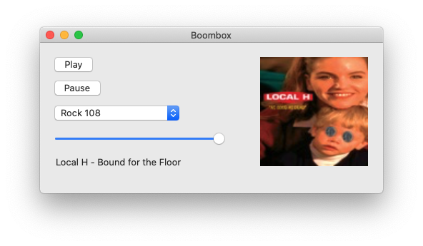 The first Boombox prototype was built on macOS with AppKit
The first version was very simple. There was a hardcoded dropdown with stations, play and pause buttons, and some basic track information. It evolved quickly, gaining the ability to identity tracks and display album artwork[1].
I ran this version for weeks… maybe even a month? Time was pretty fuzzy mid-2020.
Even in its simplicity, the prototype accomplished two things. First, it satisfied my desire to have quick access to a couple of stations, and brought to light a few other features to explore.
I used the app constantly and started to really get attached to having a stream of music in my office. I’d hit play between meetings (or sometimes even leave it on quietly in the background). I plugged some nice speakers into my computer and enjoyed cranking it up when a favorite song would play.
I got so used to it that I started missing it when I was away from my computer.
Moving to iOS
This isn’t the first time I’ve started a project and switched platforms after I proved technical feasibility. I quickly realized that having a macOS version was great, but I’d use the app more if it was on iOS. Fortunately, all of the code I had written was built on libraries common across Apple platforms, so my effort in moving to iOS was mostly focused on creating some basic UI.
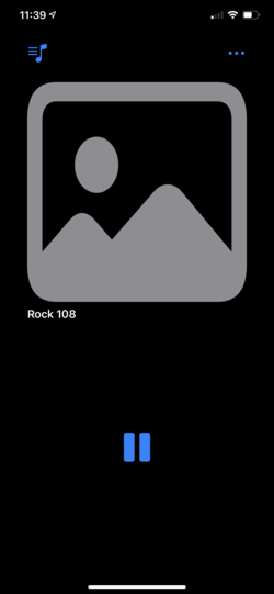
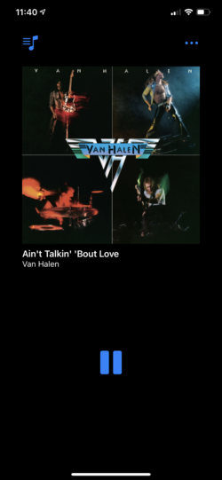
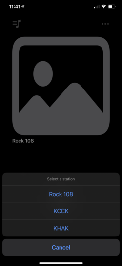
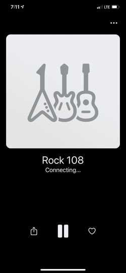
The first iOS version was a direct translation of the macOS prototype. It improved the display of track and artist information and added larger artwork. The hardcoded station list came over, too.
And to be honest, I used that version of the interface for a long time[2]. This extremely utilitarian interface helped me focus on the other interfaces I was interested in: those provided by iOS.
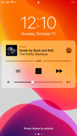
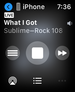
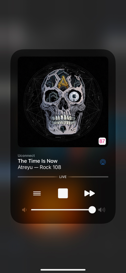
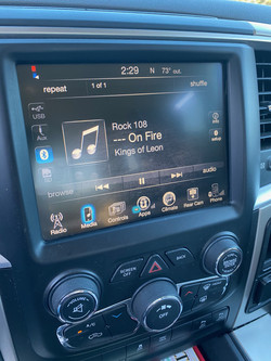
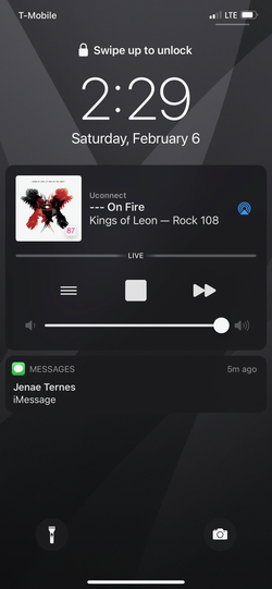
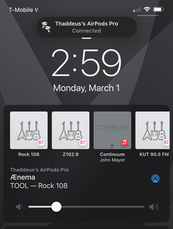
The first user-facing framework I integrated was Media Playback, so I could utilize the Now Playing controls. This enabled the app to be controlled from the lock screen, as well as display track, artist, and album artwork . And because this capability is extended to peripherals connected to iOS devices, I got support for the playback controls in my vehicles and on my watch too.
However, I quickly learned there might be some unintended consequences when the kids were in the car.
Certain titles were… not great to have displayed on an 8" screen. I quickly added the ability for the app to mask certain words. As things go in product development, that “one small feature” gave way to another: a settings screen. The ability to enable/disable the “Mask Explicit Track Info” feature is currently the only setting in the app, but I’ve added some diagnostics tools, version info, and a support button.
Building a Library
Since I had put in the work[3] to make track info available, it felt like a waste to have it shown so briefly, only to be discarded. I had seen other music apps track history, and some radio stations mention their playback history being available on their website.
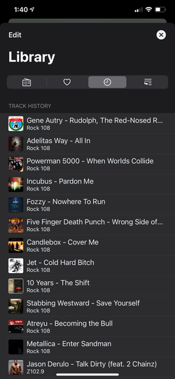
So, I put together a quick implementation of the Library screen. It contained a (still hardcoded) station list, the track history view shown above, and a favorite track list, which shows individual songs that are liked / favorited and shown separately from playback history. While the library was initially built with Core Data, I ended up moving to an implementation on top of the venerable GRDB SQLite library, which has been a delight to use.
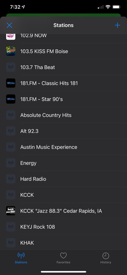
Eventually, I got around to making the station list dynamic, as well as refining the station list view quite a bit (the current version is further refined than what is shown above). The app now has a pre-defined set of stations (to avoid an empty-state on first launch) with the ability to search and add stations, or specify a station name and URL manually. The CRUD features related to station management could be the least-used screens in the app. They are definitely the ones I feel the most vulnerable about; they’re functional, but very basic and uninspiring.
However, by the time I added the station library features, I’d convinced myself I might actually ship this someday, so my efforts shifted toward other improvements and starting to think about what an MLP[4] would look like.
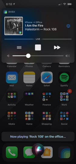
Hey Siri…
One of the lovable features I really wanted to build was support for SiriKit. With a list of stations now captured in a database, it felt like the right time to add this capability.
There are two parts of the framework used by BMBX:
- Intent Donation: when the app plays stations, it donates
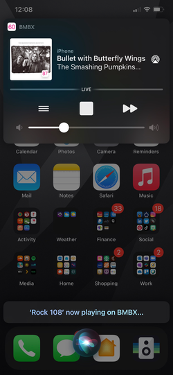
INPlayMediaIntentto the system, giving hints as to what should be suggested later. - Intent Handling: requests from Siri to play media are received by the application. For example, you can tell Siri, “Play Rock 108” and the station will start playing, even in the background.
Since Siri also works with hands-free setups in most Bluetooth-enabled cars, I can also make these kinds of requests while driving.
Donated intents also show up in Shortcuts, which means it’s also possible to create scripts or automations that can trigger station playback. I haven’t done a lot with this yet, but it’s an area I’d like to enahnce in the future.
Refinement
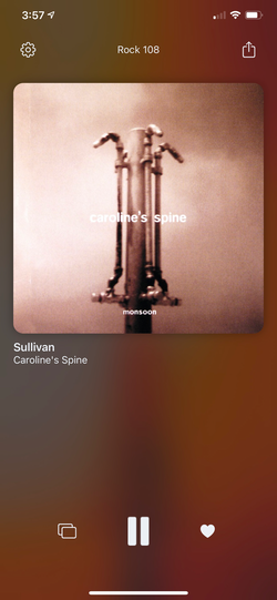
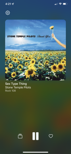
I eventually[5] got back to refining the main player view. There were actually a few different iterations of the screen over the course of about 18 months (with the final having only been implemented a few weeks ago).
As the app started to come together functionally, it was time to get more serious about branding.
The Name
I had been using the codename “Boombox” for the app since I created the first prototype, but that name is pretty weak in terms of SEO. I worked through an exploration process that included mindmapping, mood boards, and some competitive analysis, which led me to a key insight: the app is fundamentally anchored in nostalgia for me. Two particular things stood out:
- I primarily listen to stations from back home in Iowa with the app (personal history)
- The app brings a long-standing format (disc-jockey hosted radio) to a modern platform through a completely different transport (IP networks instead of AM/FM broadcast).
I needed a way to nod to the history of broadcast while giving it a modern spin. Fortunately, inspiration struct in a shower thought; the idea of incorporating a call sign dawned on me and I quickly decided on BMBX. Like many stations that bend the pronunciation of their call sign into a brand, BMBX can be pronounced either “B-M-B-X” or “boombox.”
Now that I had a name, I wanted to start talking about it.
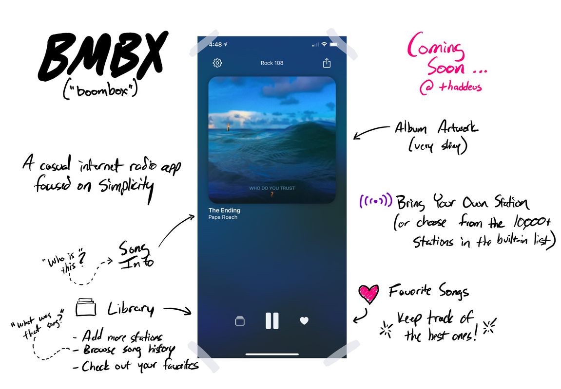 Teaser Sketch
So naturally, I tweeted about it. The teaser above was the first screenshot I shared publicly, which also included some hand-drawn notes about the features I had planned for the app.
Feedback was pretty positive: people were intrigued by the idea of listening to radio again. Maybe like me, they were feeling a sense of disconnection, and hoped to feel more a part of something happening. Or maybe they loved my awesome teaser sketch 😜
The Icon
The moodboard I created while I worked on the name gave me one other insight: I wasn’t going to be able to pull off the icon I wanted with my very basic visual design skills. I needed someone much more talented than me. I’d seen some beautiful work by designer Raphael Lopes on Twitter, so I reached out to him and was delighed when he agreed to take on my project.
The process of working with Raphael was wonderful, and I couldn’t be happier with the final version. I had shared a creative brief with Raphael that included the story of the app, details about the name, screenshots, and relevant parts of the moodboard I had created. He incorporated all of that into something even better than what I had in mind.
Wrapping Up
I hope this look at the history of BMBX has been interesting. I’m more excited about the app than anything else I’ve created personally. It’s certainly the product I’ve focused the most long-term energy on, largely in part because I use it nearly every day.
BMBX is nearly ready for a 1.0 release. If I wasn’t the one building it, I’d be encouraging its developer to just release it already, but instead I’m still nitpicking a few things. I have a huge list of things I’m excited to add, but also enjoy working on it at a casual pace. I worry releasing could change that.
If you have any questions about the app, please let me know. I’m excited to share some of the trickier things I figured out in a few blog posts I have planned.
If you’d like to try it out, BMBX is now available as a public beta on TestFlight.
This seemingly simple feature has emerged as the single most complicated part of the application. More on that another time… ↩︎
Based on screenshot timestamps, it was at least 5-6 months. ↩︎
I actually wasn’t even close to done with the metadata work… but again… more on that another time ↩︎
MLP (minimum lovable product): a minimally-produced product that doesn’t merely focus on viability, but also desirability (as well as usability) ↩︎
Development of this app has spanned almost two years, in spite of being used almost daily since the first functional prototype was running ↩︎
